2021 PANTONE COLOR OF THE YEAR

Pantone-Colors-of-the-Year-2021-1912x717.jpg

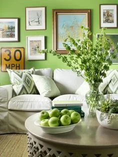
Founded in 1962, the Pantone Color Institute is the creditor of the color identification system most employed in the world. The color of the year is chosen based on an in-depth study of trends and market analysis. The entertainment industry, art, fashion, all areas of design, popular tourist destinations and new lifestyles are considered, as well as socio-economic conditions and, in this case, the general mood of the world population.

colors-of-2021-e1607722696604.jpg

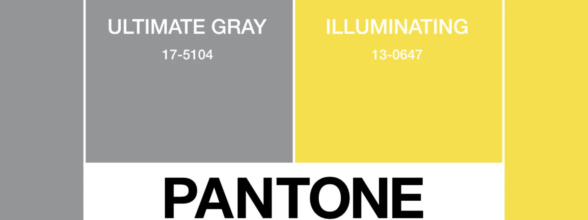
For 20 years, the American institution has chosen which color will reign the following year. Although normally there is only one, by 2021 there will be two: Ultimate Gray (17-5104) and the Illuminating (13-0647), part of the range of yellows. The two independent colors were brought together to create an aspirational color pairing, conjoining deeper feelings of thoughtfulness with the optimistic promise of a sunshine filled day.

Illuminating is a bright and cheerful yellow sparkling with vivacity, a warming yellow shade imbued with solar power. Ultimate Gray is emblematic of solid and dependable elements which are everlasting and provide a firm foundation. The colors of pebbles on the beach and natural elements whose weathered appearance highlights an ability to stand the test of time, Ultimate Gray quietly assures, encouraging feelings of composure, steadiness, and resilience.

Sherwin-Williams Debuts 2020 Color of the Year: Naval

interior-design-cosentino-kitchen_study_2019-2.jpg

Paint brand Sherwin-Williams today named Naval—a rich navy with hints of sapphire, which embodies the dualities of glamour and serenity—its 2020 Color of the Year. Taking cues from the decadence synonymous with the 1920s, the bold hue strikes a balance between calm and confident, and pairs well with finishes such as marble and mixed metallic.


interior-design-cosentino-kitchen_study_2019-3.jpg

Sherwin-Williams considers Naval a versatile neutral, reminiscent of the night sky—a space of infinite depth. The velvety blue morphs to suit its surrounding, whether used to create a statement in a room or as a subtle background that enables other elements to pop, such as leather furnishings and woven textiles.


interior-design-cosentino-kitchen_study_2019-7.jpg

The 2020 Color of the Year also marks a transition into a new decade of design, one likely to be influenced by the desire to indulge in a night out followed by a day of self-care. Sherwin-Williams’ annual Colormix Forecast, which draws on research from the brand’s global color and design team, expects warmer neutrals and biophilic colors, like greens and blues, to inform the aesthetics of interiors in coming years.

2019 PANTONE COLOR OF THE YEAR - LIVING CORAL

ei.jpg

PANTONE 16-1546 Living Coral emits the desired, familiar, and energizing aspects of color found in nature. In its glorious, yet unfortunately more elusive, display beneath the sea, this vivifying and effervescent color mesmerizes the eye and mind. Lying at the center of our naturally vivid and chromatic ecosystem, PANTONE Living Coral is evocative of how coral reefs provide shelter to a diverse kaleidoscope of color.

COTY_block-2.jpg

2018 PANTONE COLOR OF THE YEAR - ULTRA VIOLET

Complex and contemplative, Ultra Violet suggests the mysteries of the cosmos, the intrigue of what lies ahead, and the discoveries beyond where we are now. The vast and limitless night sky is symbolic of what is possible and continues to inspire the…

Complex and contemplative, Ultra Violet suggests the mysteries of the cosmos, the intrigue of what lies ahead, and the discoveries beyond where we are now. The vast and limitless night sky is symbolic of what is possible and continues to inspire the desire to pursue a world beyond our own.

Enigmatic purples have also long been symbolic of counterculture, unconventionality, and artistic brilliance. Musical icons Prince, David Bowie, and Jimi Hendrix brought shades of Ultra Violet to the forefront of western pop culture as personal expressions of individuality. Nuanced and full of emotion, the depth of PANTONE 18-3838 Ultra Violet symbolizes experimentation and non-conformity, spurring individuals to imagine their unique mark on the world, and push boundaries through creative outlets.

Historically, there has been a mystical or spiritual quality attached to Ultra Violet. The color is often associated with mindfulness practices, which offer a higher ground to those seeking refuge from today’s over-stimulated world. The use of purple-toned lighting in meditation spaces and other gathering places energizes the communities that gather there and inspire connection.

Quote.jpg

Schumacher Shengyou Toile

Shengyou Toile is based on a priceless 18th-century document in Schumacher's archives by court painter Jean-Baptiste Pillement. Hand-drawn and engraved, this pattern has rich dimension.

2017 Pantone Color of the Year...Greenery

A refreshing and revitalizing shade, Greenery is symbolic of new beginnings.

Greenery is a fresh and zesty yellow-green shade that evokes the first days of spring when nature’s greens revive, restore and renew. Illustrative of flourishing foliage and the lushness of the great outdoors, the fortifying attributes of Greenery signals consumers to take a deep breath, oxygenate and reinvigorate.

Greenery is nature’s neutral. The more submerged people are in modern life, the greater their innate craving to immerse themselves in the physical beauty and inherent unity of the natural world. This shift is reflected by the proliferation of all things expressive of Greenery in daily lives through urban planning, architecture, lifestyle and design choices globally. A constant on the periphery, Greenery is now being pulled to the forefront - it is an omnipresent hue around the world.

A life-affirming shade, Greenery is also emblematic of the pursuit of personal passions and vitality.

2016 Pantone Colors of the Year

For the first time Pantone has forecasted two shades as their ‘Color of the Year’.  This year’s selections are Rose Quartz #13-1520, a pale pink, and Serenity #15-3919 which is baby blue, which may be good news for expectant parents!

According to a press release, the two colors are "a harmonious pairing of inviting shades that embody a mindset of tranquility and inner peace."

For interiors, Pantone projects the combination of Rose Quartz and Serenity will bring a sense of calm and relaxation to the home. The color institute says the two shades are ideal for rugs and upholstery, and should also be prevalent in paint and decorative accessories.

In selecting the Color of the Year, Pantone explores influences in the entertainment industry and films in production, traveling art collections and new artists, fashion, all areas of design, popular travel destinations, as well as new lifestyles, playstyles and socio-economic conditions. Influences may also stem from new technologies, materials, textures and effects that impact color, relevant social media platforms and even up-coming sporting events.

Autumn Begins....

The first day of Fall has passed, and as we look forward to cooler temperatures and impending holidays, we can’t help looking around and wanting to incorporate some autumnal changes into our décor.  Here are some easy ideas to ease you into the season:

1.        Use tree branches for a table centerpiece

2.       Change the sheets and blankets

3.       Wrap white pumpkin in vines

4.       Add some colorful corn cobs around a candle tied up with string

5.       Paint chevron stripes on pumpkins

6.       Use glass jars and vases filled with leaves and other fall goodies

7.       Go nuts making a wreath

8.      Create a classic still life with pumpkins, nuts, and gourds

Radiant Orchid - 2014 Colour of the Year


Pantone, the global authority on colour, released Radiant Orchid as the 2014 Colour of the Year…a vibrant, royal, papal hue with Fuchsia, Purple, and Pink undertones that invigorates everything it covers.  From hair colour to household kitchen equipment, Radiant Orchid is the on trend hue.

Embrace this colour without breaking your budget by painting an accent wall, or add throw pillows to make your room pop with a burst of colour.  If this colour really floats your boat, make a real commitment and go wild – saturating your space from the floor to the ceiling with varying shades.    Beautiful and adaptive, Radiant Orchid will spruce up your space and compliment shades of Olive, Buttermilk, Gold, Teal, Orange, Grey, Lavender, Pink, and smoky soft blues to create a statement-making space.

The colour purple is synonymous with royalty, luxury, dignity, wisdom, spirituality, passion, vision, magic, wealth, sophistication, and intelligence.

Be sure to check out our Colour Palette:  Purple Reign for some exciting products that incorporate this exhilarating Colour of the Year.